

Naru -
Hydrate. Dominate.
Electrolyte powder
packaging and brand refresh
CLIENT:
shot by bullet
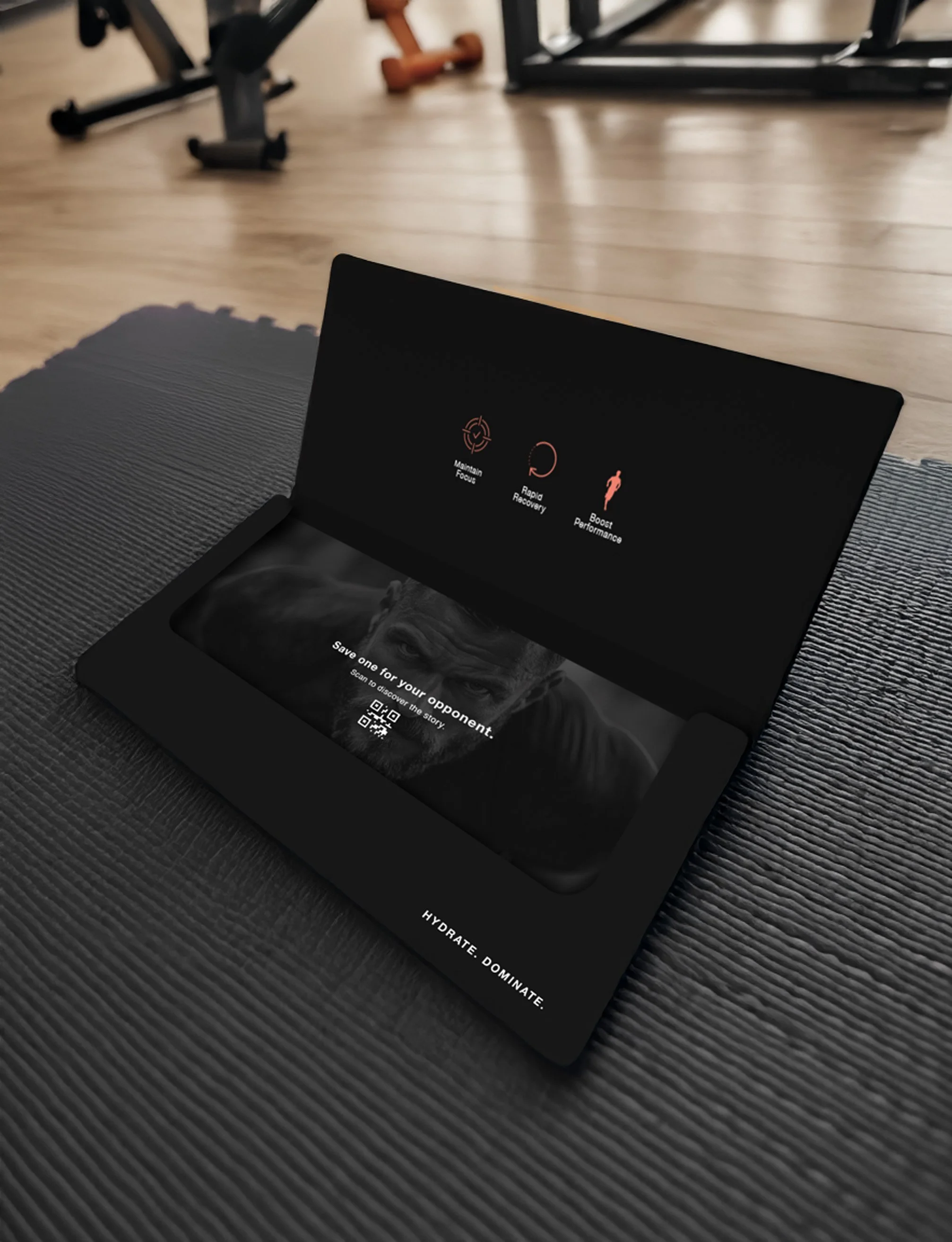
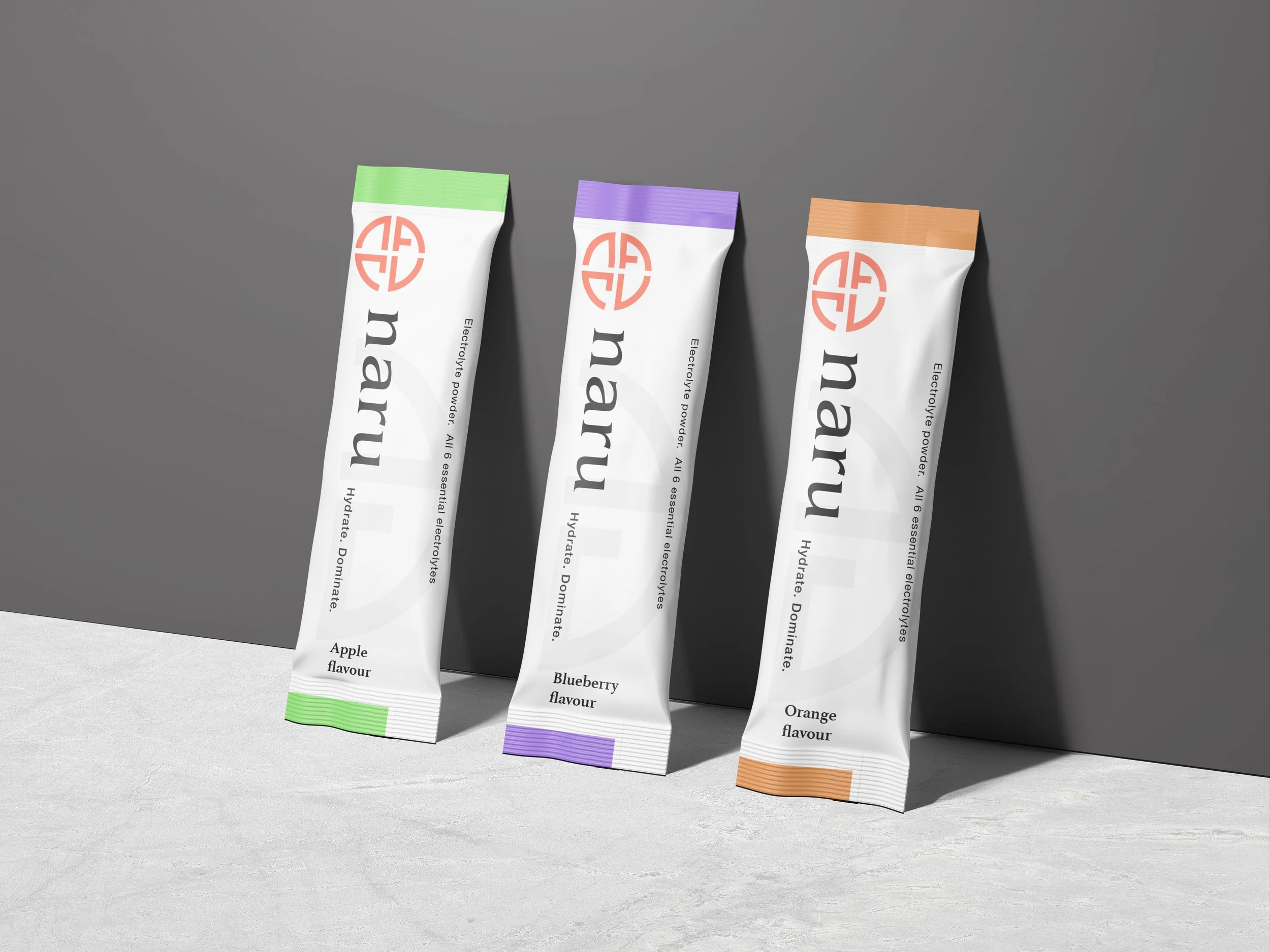
Our work with NARU focused on refining their brand identity while maintaining the core elements that define them. We explored new typography options, considering different lockups,' all integrated with their existing badge to ensure consistency. The colour palette was carefully considered, developing two primary directions: a white-led approach that enhances contrast with combat sports photography for a clean and minimal aesthetic, and a black-led version that delivers a stronger, more masculine presence. Supporting colours, including peach and pink from their existing brand guidelines, were subtly incorporated to provide balance and versatility.
We also worked on defining the brand’s core values, focusing on resilience, discipline, adaptability, body awareness, sportsmanship, and self-awareness. These principles were embedded into the brand messaging and design to reinforce NARU’s commitment to performance and personal growth.
Additionally, we developed packaging concepts and visual styling for their electrolyte supplement, ensuring that the brand’s "Hydrate. Dominate." message remained central to all communications. The photography style was curated to align with the brand's bold yet minimal approach, ensuring a cohesive and impactful visual presence across all touchpoints.